
TUTOR ORIEL
Ux Ui Product Branding
Solo Project 8 Weeks 09/2022
Tutor Oriel is an online tutoring service for high school students. They were suffering from low engagement and account creation rates due to a confusing onboarding process and poor design. I devised a new layout strategy and rebrand.
I cleaned up the sign-up flow so that it was easy to follow. I designed it so that the users could explore the product before being asked to commit financially.
Cle
What is wrong with the site?
I used Nielson Norman Group’s 10 Usability Heuristics for User Interface Design to assess the state of the current site and break down the usability problems.


I assigned scores to each of the 10 heuristics. Visibility of system status, user control and freedom and aesthetic and minimalist design scored worst.

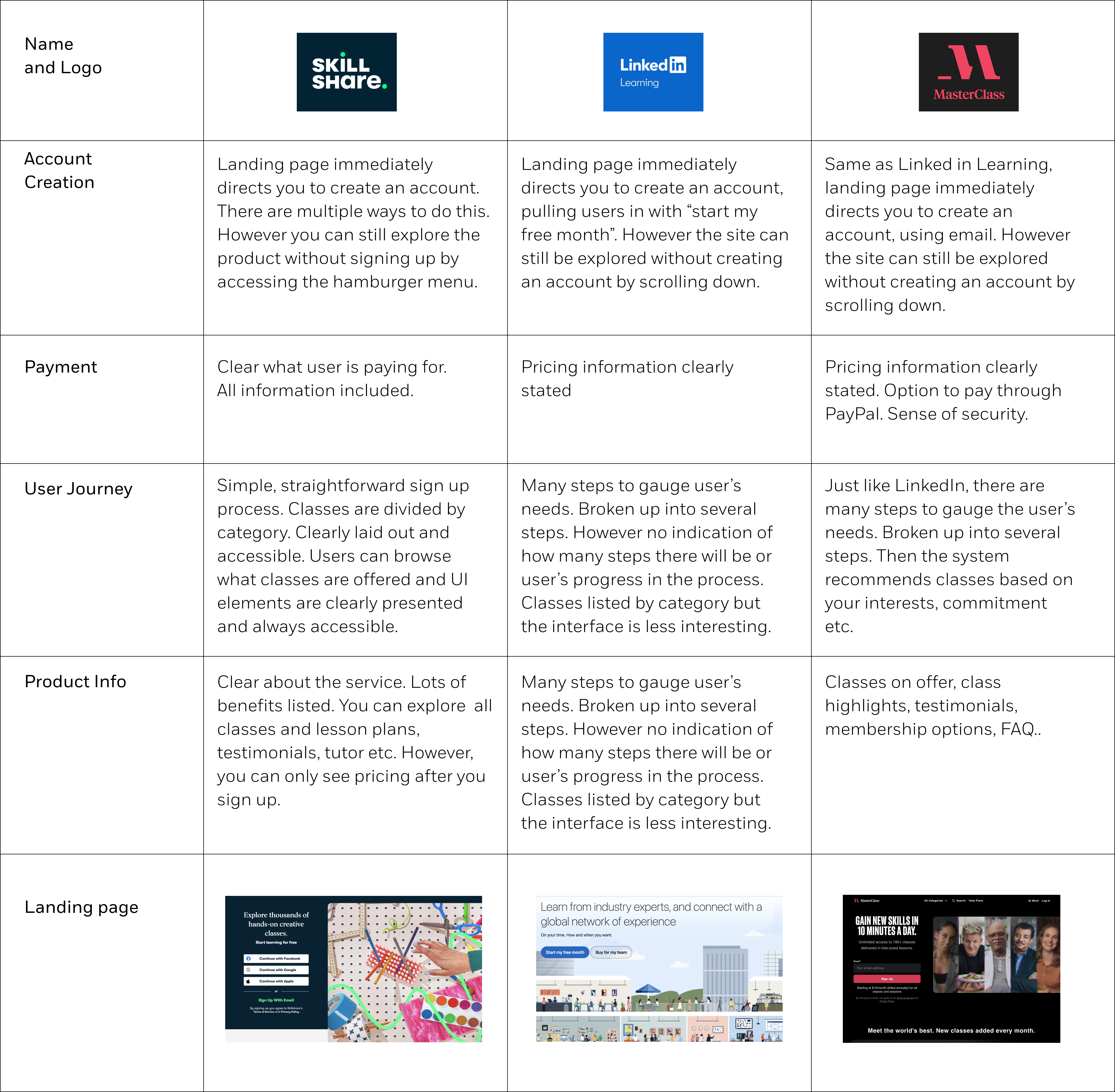
I looked at competitors UX processes in my key issue areas to understand how other companies were tackling these issues. This research informed my system design.
How can it be fixed?
I began by loosely sketching potential UI layouts and system maps that would improve on the current model

I moved on to sketching on-screen and testing my designs and flows with users.
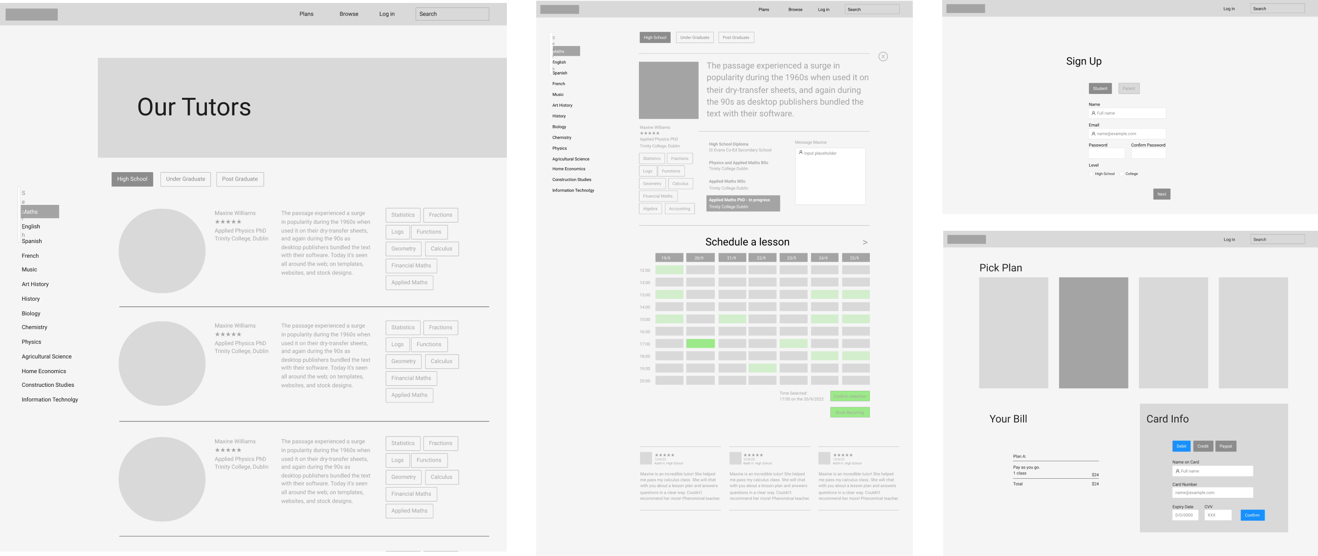

I user personas and journey maps to deepen my understanding of the problem and what would be required in the solution.
Testing:
Which solution will work?
Which solution will work?
I tested on users who are in high school, college or work in the education field. I chose a range of ages, nationalities and backgrounds.
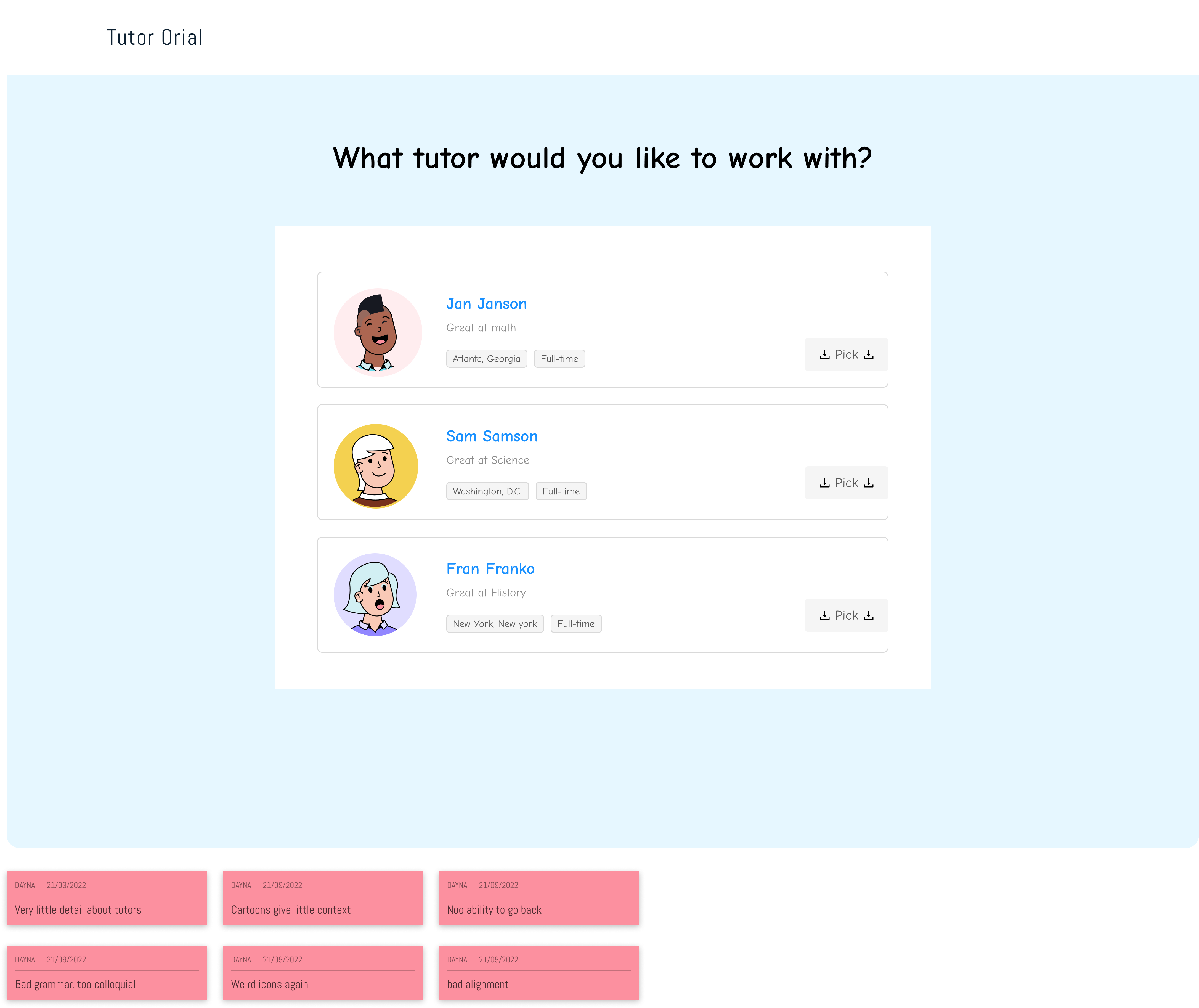
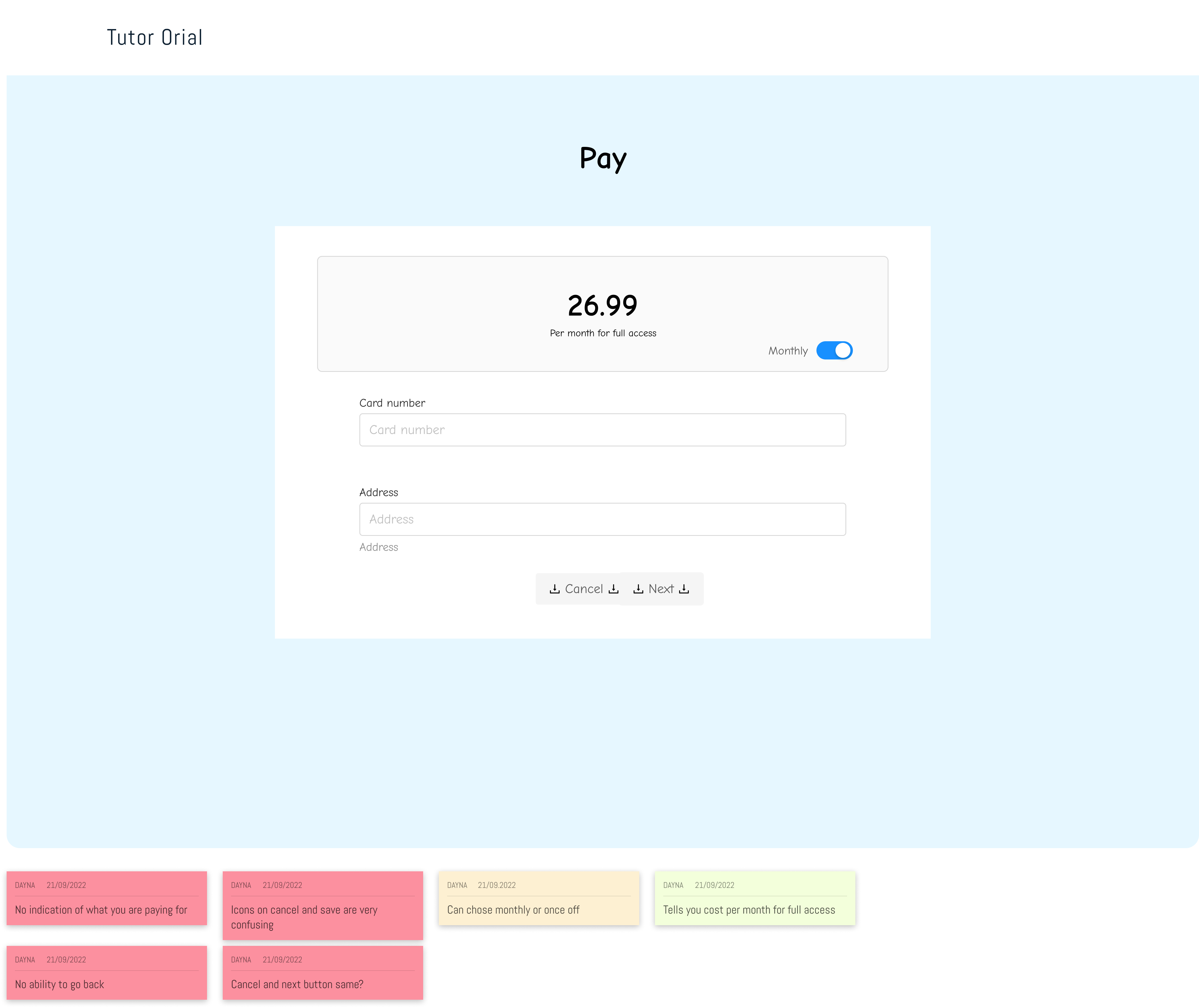
I recorded and transcribed my interviews. I then analysed the content and synthesised it. I annotated my prototype with the relevant sketches.
Prototype:
What is the solution?
What is the solution?
I used a palette of bright colours and friendly copy as the majority of my target audience is highschool students. I tried to give the brand a scholastic feel by useing horizontal lines throughout the design to emulate copy books.


NEXT
